Case study08 / El Pino
Building a timeless lifestyle brand inspired by nature.
A complete brand strategy and identity system designed to position El Pino as a premium lifestyle brand with a cohesive visual language and foundation for long-term growth.
- Client
- El Pino
- Industry
- Lifestyle
01Overview
Creating more than a logo.
El Pino needed more than a new visual identity. The ambition was to create a lifestyle brand that could grow across products and touchpoints while remaining recognizable and consistent.
We aligned business strategy, customer perception, and visual identity into one connected brand system.
Our role
- Brand Strategy
- Positioning
- Naming Strategy
- Logo & Identity
- Brand Guidelines
- Marketing Strategy
- Packaging Strategy
- Digital Brand Direction
02The Challenge
Premium today. Relevant tomorrow.
El Pino needed an identity flexible enough to support future products and audiences without losing its personality.
The brand needed to communicate:
- Timeless elegance
- Natural craftsmanship
- Quiet confidence
- Premium quality
- Sustainability

03Strategy
Strategy before design.
Before developing the visual identity, we established the foundation behind the brand:
- Vision
- Mission
- Personas
- Positioning
- Values
- Tone of Voice
- Growth Direction
These decisions guided every creative choice that followed.
04The Logo
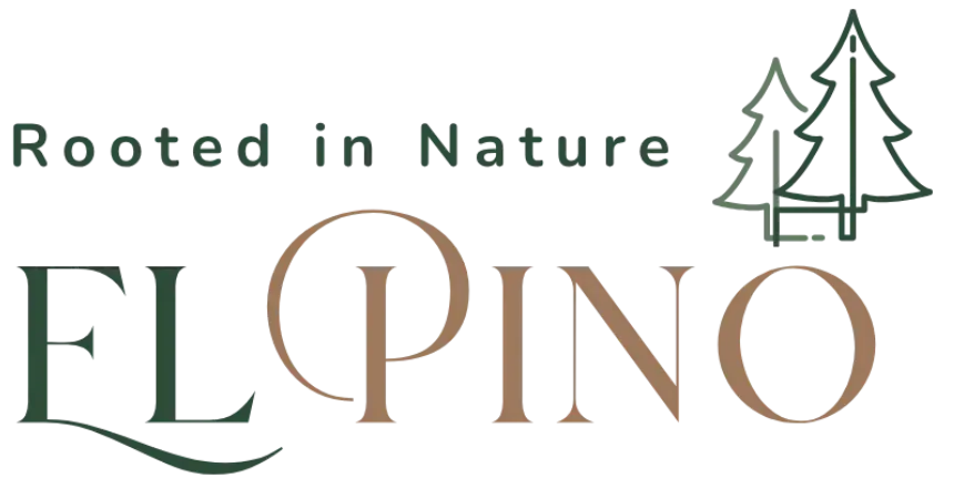
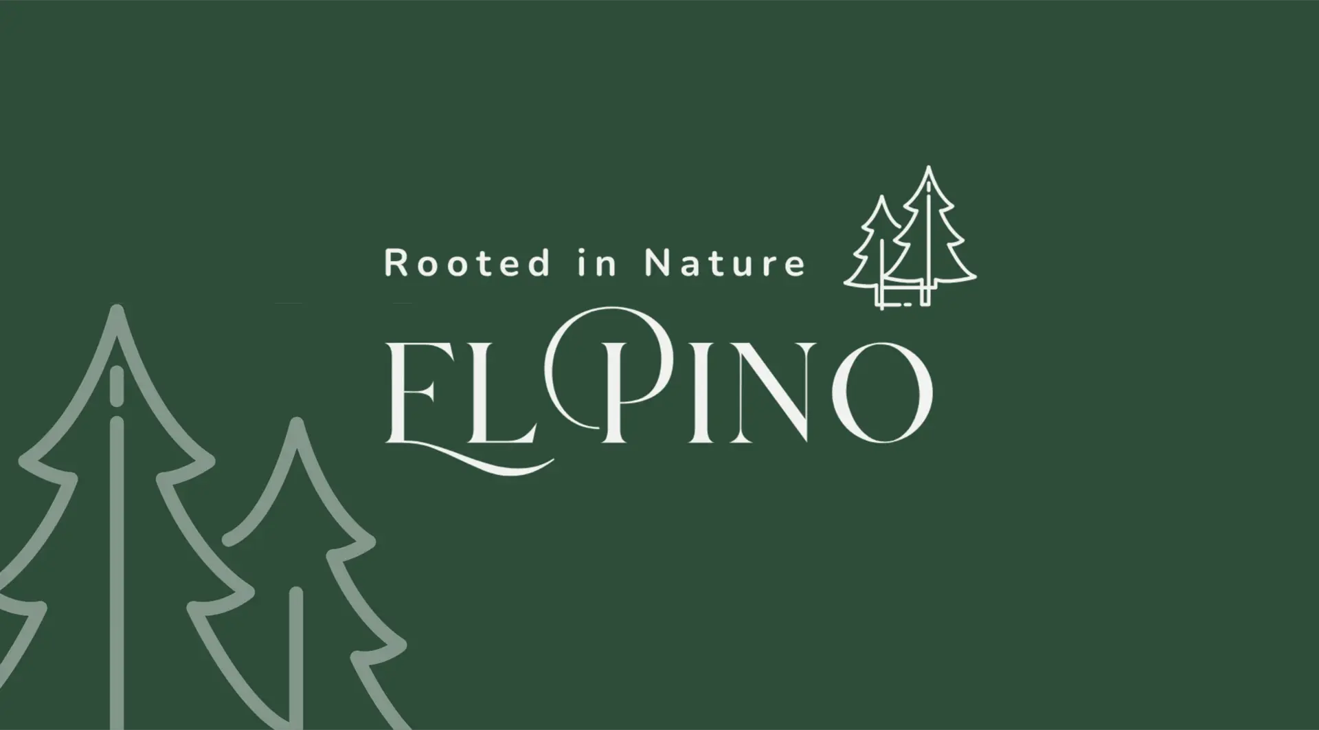
Inspired by nature. Designed for longevity.
The El Pino logo draws from the quiet strength and resilience of the pine tree.
The simplified mark combines growth, authenticity, craftsmanship, and timelessness into an adaptable identity designed to work across packaging, digital platforms, and future collections.
05Visual Identity
A visual language inspired by nature.
The identity combines natural inspiration with editorial simplicity to create a calm, refined, and enduring aesthetic.
The system includes:
- Typography
- Color
- Iconography
- Graphic Language
- Photography Direction
- Brand Applications
Every element was designed to work as part of one cohesive system.
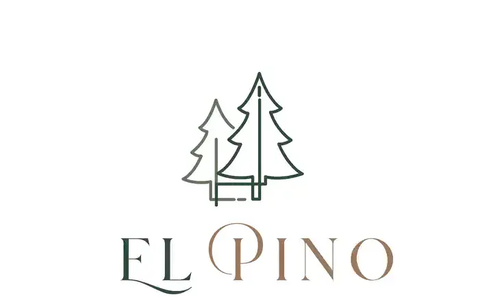
Logo
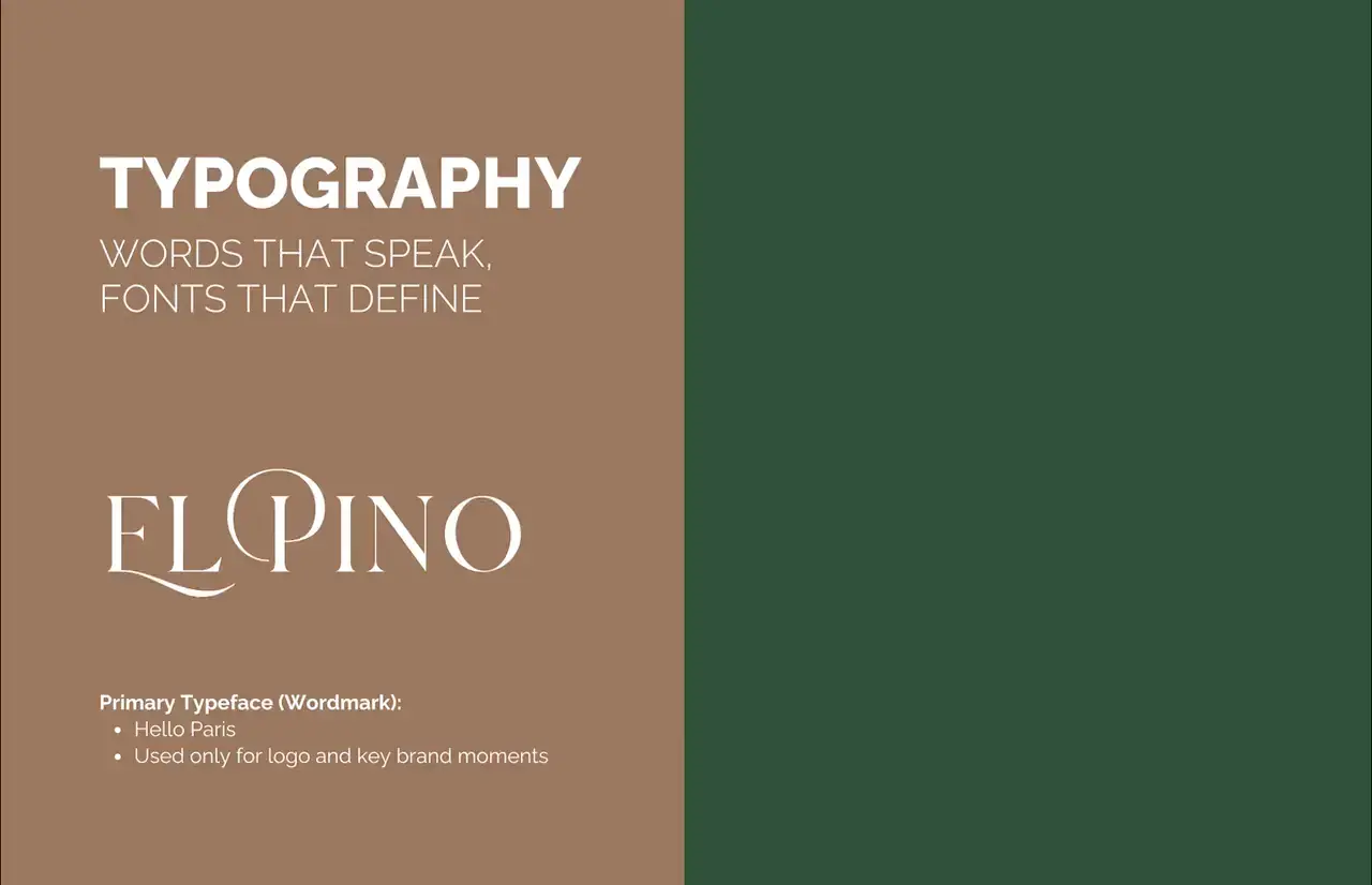
Typography & icons
Typeface
Hello Paris
Primary typeface (wordmark), used only for the logo and key brand moments.
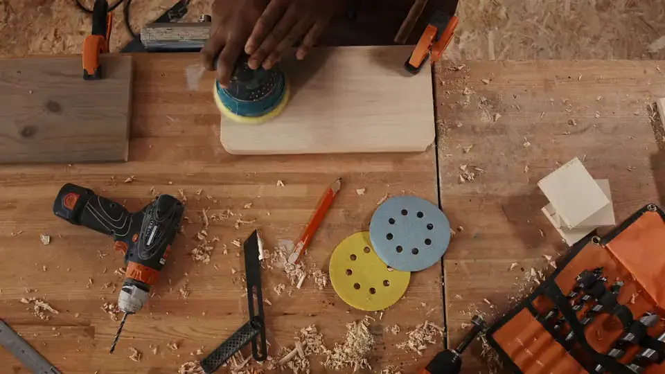
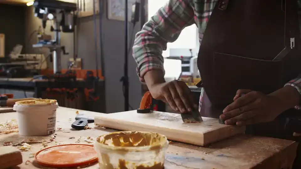
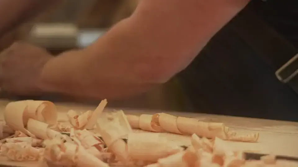
06Photography
Natural light. Quiet moments.
Photography focuses on natural materials, textures, products, and calm environments, using earthy tones and soft shadows to reinforce the brand's personality.
07Brand Applications
One identity across every touchpoint.
The identity extends across social media, print collateral, packaging, and digital experiences through consistent layouts, materials, colors, and photography.
08
Brand Identity System
Logo System · Color Palette · Typography · Iconography · Photography Direction · Packaging · Social Media · Print · Website
09Packaging
Designed to be kept, not thrown away.
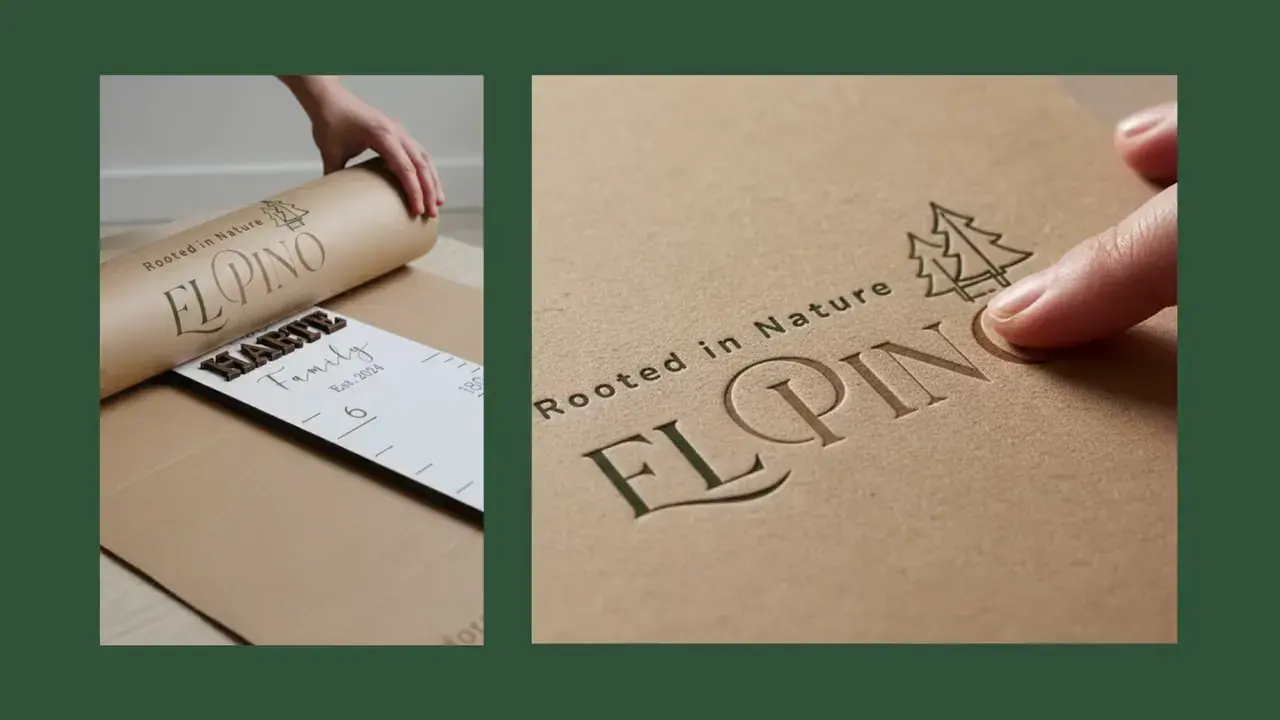
FSC kraft paper, matte cardboard, cotton, linen, minimal ink, and subtle embossing create a tactile packaging experience aligned with El Pino's sustainable luxury positioning.
10
Project highlights
- Brand Strategy
- Business Positioning
- Brand Architecture
- Logo System
- Complete Visual Identity
- Brand Guidelines
- Marketing Direction
- Packaging Strategy
- Content Strategy
- Digital Brand Foundation
11What We Learned
Timeless design starts with a clear foundation.
El Pino reinforced that a strong identity isn't built from individual assets.
When strategy, design, and communication work as one system, a brand can evolve without losing what makes it recognizable.