
Building a strategic brand for founders ready to scale.
A complete brand strategy and visual identity system designed to position ORO E-Ventures as a cross-border venture growth partner, supporting founders from validation to regional and global expansion.
Overview
Turning venture growth into a clear brand experience.
ORO E-Ventures is a cross-border venture growth catalyst that partners with founders through structured venture development, market access, and long-term support. The goal was to create a brand system that communicates structure, credibility, growth, and founder partnership across every touchpoint.
The Challenge
Building a brand for growth beyond borders.
ORO needed to communicate a model that goes beyond traditional incubation or short-term acceleration. The brand had to clearly communicate its role as a long-term venture partner while remaining credible to founders, investors, ecosystem partners, and mentors.


Strategy
Structure before aesthetics.
The brand foundation was built around a clear mission: helping founders build, scale, and expand through a guided, founder-aligned growth model. The strategy defined the brand's vision, mission, positioning, target audiences, messaging, and tone of voice before moving into the visual identity.
Brand Positioning
A strategic partner, not just another program.
ORO E-Ventures positions itself around five key principles: Structured Growth · Partner-Led Model · Cross-Border by Design · Aligned Incentives · Ecosystem-Powered Together, they communicate a model built around long-term venture development rather than short-term programs.
Logo
A mark built around growth and continuity.
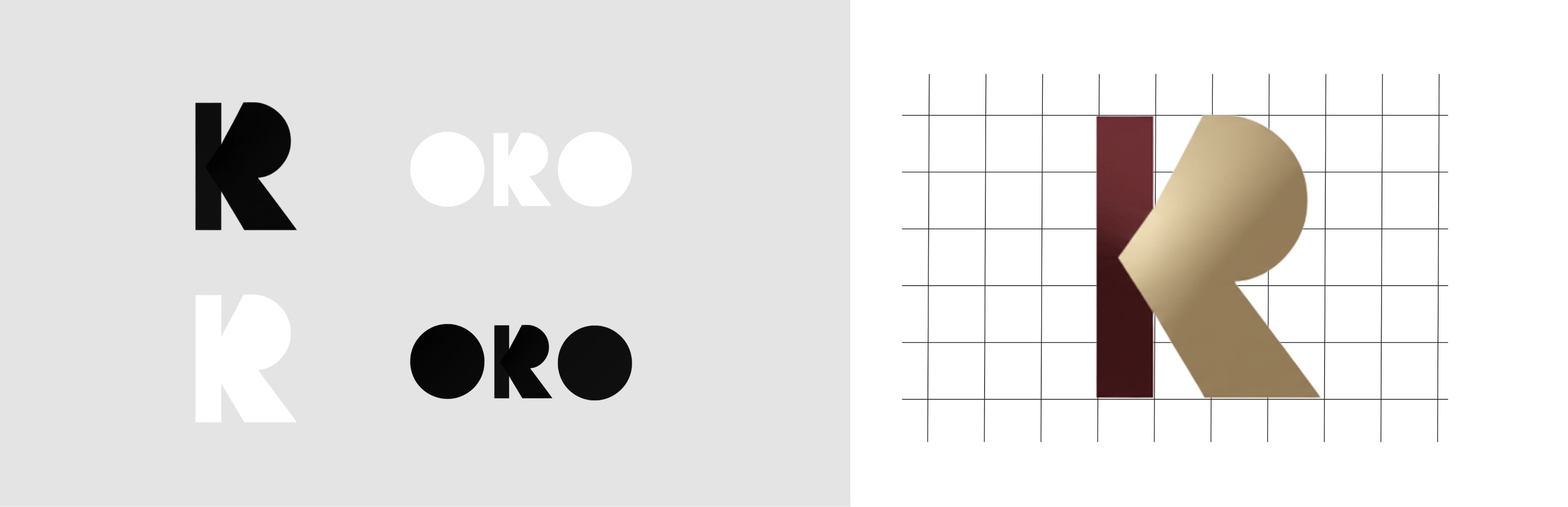
The logo combines a premium gold gradient with deep maroon, while the circular forms of O-R-O represent the venture lifecycle and continuity. The embedded arrow within the R represents forward momentum, directional growth, and the transition from idea to scale.
Visual Identity
Premium, structured, and mature.
The identity was designed to communicate authority without feeling corporate or distant. A deep navy foundation, maroon, blue-grey, and gold create a visual language that reflects value, leadership, growth, and credibility.
Typography
Clarity with character.
The typography system combines the structured, geometric qualities of Montserrat with a more expressive supporting typeface. Together, they create a balance between professional credibility and warmth across digital and print applications.

Brand Symbol
Turning the “R” into a visual language.
The R watermark became a key graphic element within the identity. Its embedded arrow communicates momentum, direction, transition, and cross-border expansion, allowing the symbol to extend beyond the logo into brand graphics and visual compositions.
Messaging
Confident. Clear. Grounded.
ORO's voice was developed around the archetype of “The Strategic Partner.” The communication style is confident without being loud, clear without being abstract, and strategic without relying on hype. The core message centers on building ventures with founders through structured growth, cross-border infrastructure, and aligned incentives.
Photography Direction
Real people. Real work. Real growth.
The photography direction focuses on founders working, strategic discussions, mentorship, and real ecosystem environments.




Illustration System
Strategy expressed through movement.
The illustration language uses geometric lines, premium gold shapes, arrows, layers, and frameworks to visually communicate venture journeys, strategic models, and market expansion. The system remains intentionally minimal and avoids playful character-based illustrations.
Brand Applications
One identity across every touchpoint.
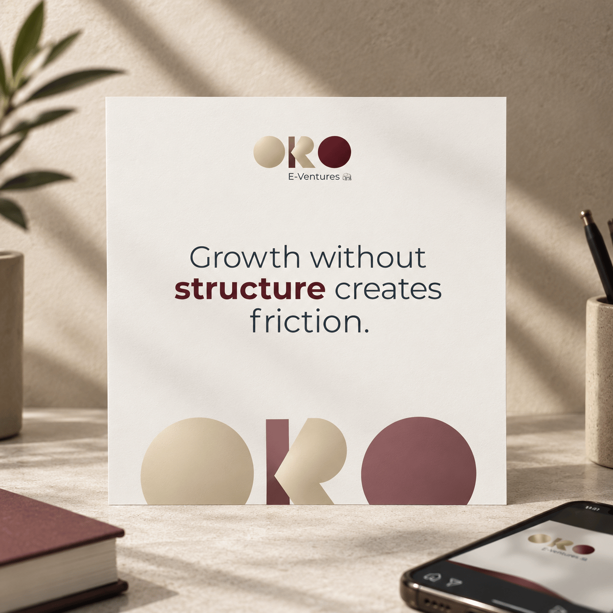
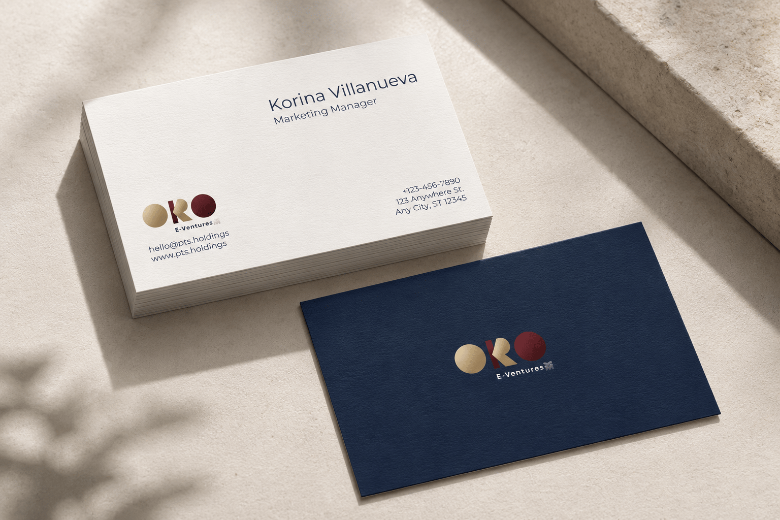
The system was extended across digital and physical applications, including website, LinkedIn, social media, presentations, stationery, and business cards. Each application follows the same visual principles to create a consistent brand experience.
Brand Identity System
One foundation. Built to scale.
Logo System · Color Palette · Typography · R Watermark · Illustration Style · Photography Direction · Messaging · Social Media · Website · Business Cards · Brand Guidelines

PROJECT HIGHLIGHTS
- Brand Strategy
- Brand Positioning
- Logo & Identity System
- Visual Language
- Typography System
- Photography Direction
- Illustration System
- Messaging Framework
- Brand Guidelines
- Digital & Physical Applications
What We Learned
Strong venture brands need structure behind the story.
ORO E-Ventures reinforced that a brand can communicate complex business models through clear positioning, consistent visual language, and purposeful messaging. The result is a flexible identity designed to grow with the ventures, founders, and markets ORO supports.
YOUR NEXT CHAPTER